
Sleep is one of the cornerstones of our physical and mental health. However, for quality sleep, it is not only the duration of sleep that matters, but also the sleep environment. One of the most important elements shaping the sleep environment is color. The colors used in the bedroom can either speed up or hinder the process of falling asleep. In this guide, you will discover the effects of colors on sleep, how they can be used in bedroom decor, and how you can perfect this experience with SlothBedding products.
Sleep-Inducing Colors and Their Psychological Effects
The psychological effects of colors play a significant role in both our mood and our sleep quality. Research shows that certain color tones facilitate falling asleep due to their calming effects, while some colors can provide energy and negatively affect the sleep process. By choosing the right colors for your bedroom, you can enhance both the aesthetic of your decor and your sleep quality.
The Relaxing Effect of Blue and Green Tones
Blue is a frequently preferred color in bedrooms. This is because blue tones have a stress-reducing and calming effect. Furthermore, with its ability to lower blood pressure and slow heart rate, blue stands out as one of the most ideal colors to support sleep. Using light blue sheets, duvets, or curtains, in particular, can accelerate the process of falling asleep.
- Psychological Effect: Blue calms the mind and creates a feeling of relaxation.
- Usage in Decor: You can create a peaceful atmosphere with light blue sheets, blue-toned pillowcases, and pastel blue wall paint.
Green is one of the best ways to bring the calming effect of nature into your bedroom. This nature-evoking color provides mental relaxation and creates a refreshing atmosphere. Pastel green or light green tones are particularly suitable for bedroom decor.
- Psychological Effect: Green creates a sense of balance and tranquility. It is easy on the eyes and promotes relaxation before sleep.
- Usage in Decor: You can create a natural ambiance by using green tones in your pillowcases, duvets, or curtain accessories.
SlothBedding Recommendation:
Blue and green tones harmonize perfectly with SlothBedding's minimalist and technological beds. For example, the LOGIC Air Clean Hybrid Mattress, when combined with these tones, offers both an aesthetic appearance and comfort that will enhance your sleep quality. Additionally, SlothBedding mattresses' anti-allergenic and breathable features are ideal for a peaceful sleep experience.
A Minimalist Sleep Environment with Neutral Tones
Neutral colors symbolize simplicity and tranquility. These colors, especially in bedrooms, help the mind relax by creating an atmosphere free from clutter. Neutral tones make it easier to focus on sleep because they are not distracting and create a calming environment.
White is one of the most popular neutral colors. Symbolizing purity and cleanliness, white creates a fresh look in the bedroom while also establishing a calm atmosphere. White sheets and duvets provide an environment that supports falling asleep.
- Psychological Effect: White clears the mind and gives a sense of calm.
- Usage in Decor: You can create a minimalist style with an all-white bedding set. However, you can also enrich the visual appeal with small pastel touches.
Cream and Gray Tones are ideal choices for a modern and minimalist design. These tones offer a decorative style that is easy on the eyes and also harmonize easily with other colors.
- Psychological Effect: Cream tones offer a relaxing warmth, while gray tones create a balanced atmosphere.
- Usage in Decor: Duvets or bedspreads in cream and gray tones are perfect for a simple and peaceful bedroom.
SlothBedding Recommendation:
SlothBedding products perfectly complement the elegance of neutral tones. In particular, the LOGIC Air Clean Hybrid Mattress, with its simple and modern design, creates an aesthetic integrity with white, cream, and gray toned decors. Furthermore, the technological features of these mattresses enhance not only visual aesthetics but also sleep quality.
Points to Consider When Choosing Colors
-
Light and Tone Selection:
The effect of colors can vary depending on the light and tones used. For example, a pastel version of a blue tone may have a calming effect, while a dark blue may create a more serious and heavy atmosphere. It is important to prefer pastel tones with soft lighting in your bedroom. -
Personal Preferences:
The psychological effects people derive from colors vary. Although colors like blue or green generally have a calming effect, making choices that suit personal preferences is always best. -
Compatibility of Colors with Beds and Textile Products:
It is important that the colors in your bedroom decor harmonize with main elements like the bed and duvet. SlothBedding beds, with their simple and neutral design, provide an ideal base for any color combination.
Colors to Avoid in the Bedroom
Not every color is suitable for a sleep environment. Some colors can activate the mind with their stimulating effects, making it difficult to create a peaceful sleep environment. When choosing colors for your bedroom, it's important to avoid such distracting or stimulating colors and opt for pastel tones that aid sleep. Here are the colors to avoid and their effects:
The Stimulating Effect of Red and Orange
Red is a symbol of energy, passion, and vibrancy. This color is often preferred in restaurants due to its appetite-stimulating effect. However, when used in the bedroom, this high energy feeling can make it difficult to fall asleep. Red tones can raise blood pressure, keeping the body awake and active instead of resting.
- Psychological Effect: Red increases adrenaline levels, preventing relaxation. Therefore, this color should be avoided in resting areas like the bedroom.
- Areas Not Recommended for Use in Decor: The use of red color in headboards, sheets, and curtains is not recommended. If you cannot give up red, you can only choose this color for small decorative objects.
Orange is a warm and enthusiastic color. Although it may seem like a gentler tone, intense and bright orange tones can stimulate the mind and make it difficult to fall asleep. This energetic effect of orange can disrupt the relaxation process before sleep.
- Psychological Effect: Orange increases energy levels and stimulates brain activity. Bright tones, in particular, should be avoided.
- Areas Not Recommended for Use in Decor: Instead of orange tones in prominent elements such as sheets, pillowcases, and duvets, calmer pastel tones should be preferred.
Distracting Features of Very Bright Colors
Neon colors and other excessively bright tones, with their eye-catching properties, make it difficult to create a peaceful atmosphere in the bedroom. These colors create stimulating effects on the mind, distracting attention and preventing focus on sleep. Especially tones like neon pink, bright yellow, or neon green should not be preferred in the bedroom.
- Psychological Effect: Neon tones activate the mind and negatively affect the calming process. They create an unnecessary sense of energy in the bedroom.
- Alternative Decor Suggestion: Instead of bright colors, you can opt for more peaceful options from the same color family by choosing pastel versions of these tones.
Creating a Relaxing Environment with Pastel Tones
Opting for pastel tones in color selection allows you to create both a peaceful and stylish atmosphere in your bedroom. Pastel tones offer a soft feel without straining the eyes and have a soothing effect on the mind. For example:
- Instead of bright red, pastel pink or light peach tones provide a calmer and more comfortable atmosphere.
- Instead of bright orange, light beige or pastel yellow tones can be used.
SlothBedding Recommendation: Pastel Tones and Comfortable Products
SlothBedding stands out with its minimalist and technological designs that perfectly harmonize with pastel tones. These colors not only enhance the aesthetics of your bedroom but also help you create a peaceful sleep environment.
- For example: The LOGIC Air Clean Hybrid Mattress, combined with pastel-toned bedspreads and sheets, creates a sleep area that is both comfortable and stylish.
- Anti-allergenic Features: SlothBedding's mattresses have anti-allergenic and breathable features that support the tranquility of pastel tones.
You can enhance your sleep quality by combining the relaxing effect of pastel colors with the technological mattresses offered by SlothBedding. A bedroom designed with pastel tones not only offers a stylish appearance but also provides the calm atmosphere needed for healthy sleep.
Harmony of Bed, Pillow, and Color Choices
While making the right color choices in your sleep environment is important, the features of essential sleep products such as beds, duvets, and pillows should not be overlooked. Here are suggestions on how to achieve harmony between these elements and colors:
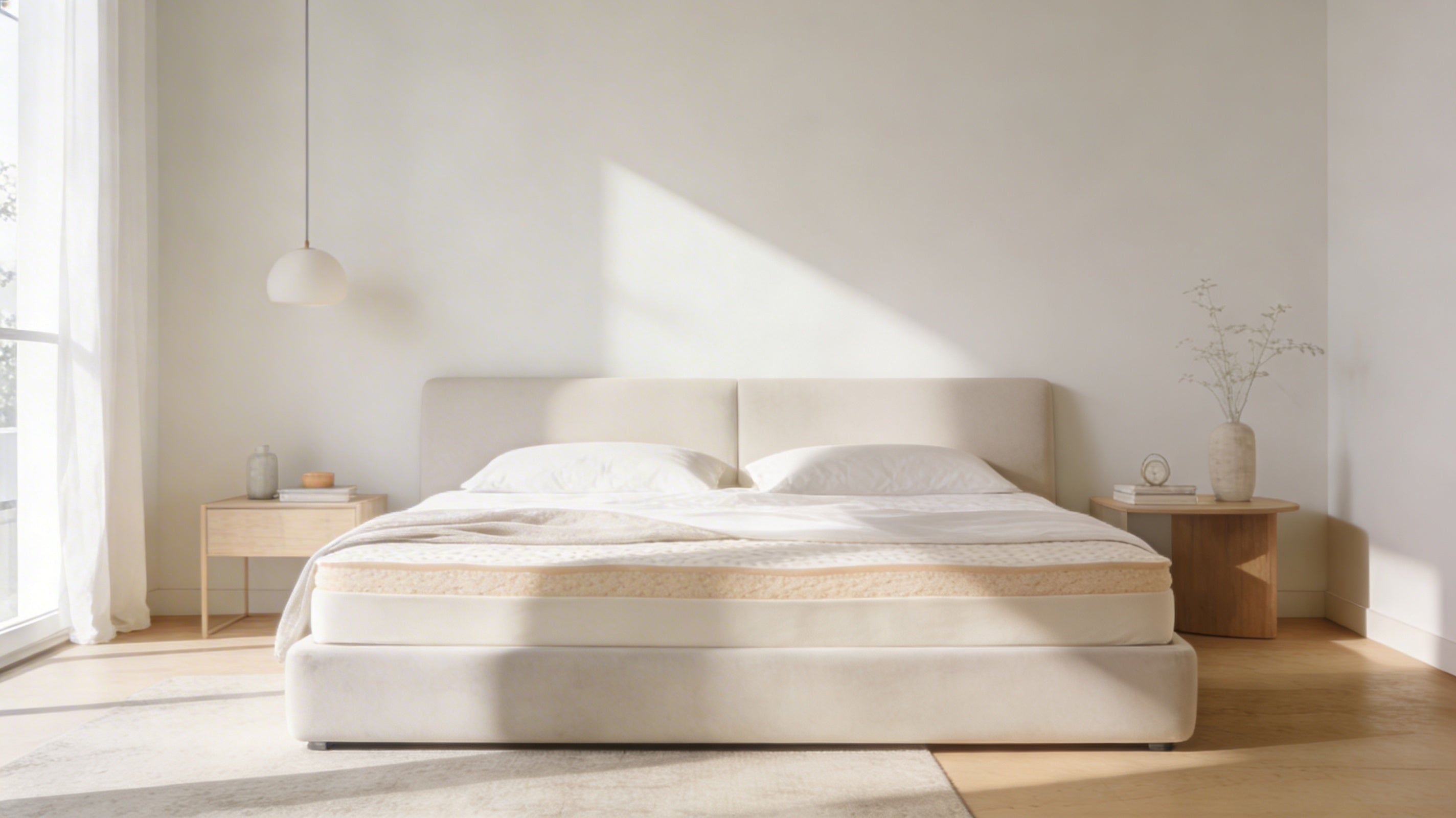
More Than Colors: The Importance of Mattress Selection
Although the effect of colors on sleep is undeniable, the support and comfort provided by the mattress play a larger role. Choosing the wrong mattress can significantly reduce sleep quality.
SlothBedding Recommendation:
- The LOGIC Air Clean Hybrid Mattress enhances your sleep quality not only with colors but also with its orthopedic support and Air Clean technology.
- The CODE Air Clean Hybrid Mattress, with its modern design and orthopedic features, offers perfect harmony in pastel-toned bedrooms.
Color and Material Harmony in Sheet and Pillowcase Selection
Sheets and pillowcases come into direct contact with our skin during sleep. Therefore, it is important not only to choose the right colors but also to opt for anti-allergenic and breathable materials.
SlothBedding Recommendation: You can maximize the effect of colors with anti-allergenic beds and pillows.
Seasonal Effects of Colors and Seasonal Choices
The colors used in the bedroom can also vary according to the seasons. Freshness should be prioritized in summer, and warmth in winter.
Light and Fresh Tones for Summer
In summer, colors like white, light blue, or pastel green create a fresh atmosphere in the bedroom.
SlothBedding Tip: Along with light and fresh tones, you can enjoy a comfortable sleep on hot summer nights by choosing the breathable designs of SlothBedding mattresses.
Warm and Soothing Tones for Winter
In winter, warm tones like dark grey, burgundy, or brown create a more comfortable atmosphere in the bedroom.
SlothBedding Tip: The CODE Air Clean Hybrid Mattress perfectly complements soothing colors in winter, perfecting your sleep experience.
Perfect Sleep Experience with SlothBedding
Colors shape your sleep environment, but the most important elements supporting this environment are the right mattress and sleep products. SlothBedding takes your sleep experience to the next level with its innovative technologies and high-quality products.
Right Mattress, Right Color, Right Sleep
To fully benefit from the psychological effects of colors, you should pay attention to your mattress and pillow selection. SlothBedding's products with Air Clean technology ensure both hygienic and comfortable sleep.
Create Perfect Harmony with Products
- LOGIC Air Clean Hybrid Mattress: Features a minimalist design that perfectly matches blue, white, and pastel tones.
- REBOOT Air Clean Hybrid Mattress: A sturdy and balanced mattress option that can be combined with winter tones.
Harmony of Color and Comfort with SlothBedding Products
In this article, we examined how the colors in your bedroom can affect your sleep quality. However, remember that the characteristics of your mattress play as crucial a role in sleep quality as the effect of colors.


Share:
What is REM Sleep?
How to Wash a Visco Pillow?